
Designing options
by Paul McGowan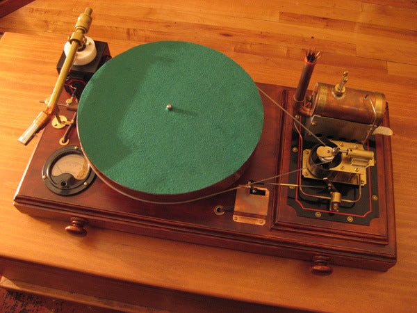
One of the biggest temptations for designers and customers alike is the addition of options. Options, options, options. How can you have too many options?
You know when you have too many options when using a product becomes daunting. JRiver Media Center is a good example. I can barely get music to play without having first spent half an hour wading through the setup options. Yet, once going it's a fine program.
As a user, I want lots of options but only if they're buried deep into the product. When I first fire up a piece of kit or a program, it should just work right out of the box. Later, if the urge strikes, I can delve into the secondary layers of options that cleverly lie underneath the surface.
As designers, options are a true double-edged sword. Committing to a product without options means you've not only thought through what's needed (and not needed) but you're so confident in those choices you're willing to be rejected by potential customers who expected a feature or function that's unavailable. And, on the flipside, building in options increases the workload rather dramatically. Just imagine the hours of programming required to add the option of input naming: building a virtual keyboard, figuring out how to access it, allowing for mistaken entries, setting limits on character lengths, storing and retrieving the data, editing.
We can't make products with so many options they make everyone happy, yet we have to offer enough that the product fulfills its purpose.
My preference has always leaned towards purpose-built products where the designer takes a stand and puts their name on the product. "This is what I would want in my home".
Of course, the alternative might just be a full-featured option-rich entry from Lirpa Labs!
Wait. I missed April 1.
 Paul McGowan
Founder & CEO
Never miss a post
SubscribeRelated Posts
-
Take a moment
Paul McGowan -
Owning music
Paul McGowan -
Feeling threatened
Paul McGowan -
Power supply phasing
Paul McGowan -
Beer budgets
Paul McGowan


Keep reading
View all-
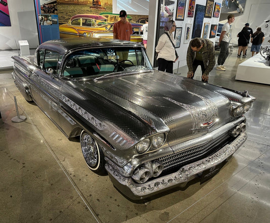
Scratching the Surface
This car was on display at the Petersen Automotive Museum in Los Angeles last summer as part of an exhibit entitled “Best in Low – Icons of the Street and Show.”...
-
Table of Contents – Issue 215
Audio show season is upon us, kicking off in the US with Florida Audio Expo, which takes place February 21 – 23 at the Sheraton Tampa Brandon. It’s the first...
Read more
Table of Contents – Issue 215
Audio show season is upon us, kicking off in the US with Florida Audio Expo, which takes place February 21 – 23 at the Sheraton Tampa Brandon. It’s the first time for me and I’m stoked to report on the show, now in a bigger venue, and get away from the Northeast winter!
CanJam NYC (New York), and the Bristol Hi-Fi Show in the UK will take place on the same weekend. Next will come Sound Society Denmark (March 1 – 2, Copenhagen), Southwest Audio Fest (March 21 – 23, Dallas, Texas), Audio Show Deluxe (March 22 – 23, Whittlebury Park, UK), Oslo Hi-Fi Show (March 22 – 23), Montreal Audiofest (March 28 – 30), Shanghai International Audio & Video Show (April 11 – 13), AXPONA Audio Expo North America (April 11 – 13, Schaumburg, IL), Northern International Audio & Visual Show (April 25 – 27, Penang, Malaysia), T.H.E. Lone Star Audiofest (May 2 – 4, Round Rock, Texas), and HIGH-END Munich (May 15 – 18)…and that’s just in the first half of 2025 and may not be an all-inclusive list.
In this issue: B. Jan Montana tells a love story. Octave Records expands its portfolio of jazz music with pianist Tom Amend’s Jazz Classics: 1960s. DALI Speakers holds an informative showcase event. Making Vinyl’s Larry Jaffee offers a vinyl industry update. Jeff Weiner concludes his series on the (sort of) roots of rock and roll. Wayne Robins goes back in time with an interview with pop music legend Lesley Gore. PS Audio’s own Paul McGowan offers an excerpt from his upcoming book series, The Audiophile’s Guide, with an installment on digital audio. We start a new photo essay series from Harris Fogel: The People Who Make Audio Happen.
Ray Chelstowski talks with singer/songwriter Paul Thorn about his new album, Just a Vapor. I continue my series on how to play in a rock band with advice on playing on bigger stages. Rudy Radelic and The Vinyl Beat cover reissues and releases from Max Abrams, the Jazz Crusaders, Donald Byrd, Andreas Vollenweider, and more. Our publishing partner FIDELITY magazine visits Vienna’s Finest Audio Show. Copper Classics features Ken Kessler checking out reel-to-reel tapes and machines. From The Listening Chair looks at the Bluesound NODE ICON. PS Audio earns accolades for the Aspen FR30 loudspeaker, Stellar Strata MK2 integrated amp, and other products. The issue wraps up with high fi, a visit to that old audio gang of mine, and lyrical architecture.

Click here for information on how to post comments in Copper.
Contributors to This Issue:
Ray Chelstowski, Frank Doris, Harris Fogel, Rich Isaacs, Larry Jaffee, Ken Kessler, Howard Kneller, B. Jan Montana, Paul McGowan, Rudy Radelic, Wayne Robins, James Schrimpf, Jeff Weiner, Peter XeniLogo Design:
Susan Schwartz-Christian, from a concept by Bob D’AmicoEditor:
Frank DorisPublisher:
Paul McGowanPost-publication Nitpicker:
Rich IsaacsAdvertising Sales:
No one. We are free from advertising and subscribing to Copper is free.Copper’s Comments Policy:
Copper’s comments sections are moderated. While we encourage thoughtful and spirited discussion, please be civil.
The editor and Copper’s editorial staff reserve the right to delete comments according to our discretion. This includes: political commentary; posts that are abusive, insulting, demeaning or defamatory; posts that are in violation of someone’s privacy; comments that violate the use of copyrighted information; posts that contain personal information; and comments that contain links to suspect websites (phishing sites or those that contain viruses and so on). Spam will be blocked or deleted.
Copper is a place to be enthusiastic about music, audio and other topics. It is most especially not a forum for political discussion, trolling, or rude behavior. Thanks for your consideration.
– FD
- Choosing a selection results in a full page refresh.
- Opens in a new window.